PROJECT OVERVIEW
As part of a research initiative, the UX team at INVIVO was tasked with evaluating medical promotional iPad apps. Our goal was to conduct usability tests despite the challenges of having limited resources and dealing with sensitive app content.
I prepared and conducted a usability study on a promotional iPad app used by medical sales reps. Based on my research, I was able to make recommendations to improve the interaction design and content organization. These were shared with our client and other teams at INVIVO.
ROLE AND KEY TASKS
UX designer at INVIVO Communications
- Conducted heuristic evaluation
- Created research plan and test scripts
- Recruited and screened participants
- Facilitated think-aloud tests
- Analyzed test recordings
- Recommended design improvements
- Presented findings
PROJECT TEAM
UX team support
BACKGROUND
What are Promotional iPad Apps?
- Presentation tools used by medical sales reps during in-person meetings with customers.
- Usability tests would reveal issues that could impact a sales rep’s ability to conduct a smooth and impactful presentation.
Test Subject: Quattro iPad App
- I conducted my study on the "Quattro" iPad app, which showcased a brand of pacemaker products using a mix of promotional messages and interactive modules.
- Unfortunately, sales reps were not available for interviews, so I conducted a heuristic evaluation to document notable issues before running my tests. The problems I found were mainly related to locating product information within interactive modules.
STUDY DESIGN
Research Hypothesis
I formed my hypothesis based on the results of my heuristic evaluation and the goals of the Quattro app:
The interactive modules in Quattro are difficult to use because of confusing states and affordances.
Sales reps may struggle to find and compare product information, which negatively affects their ability to convey selling points to their audience.


Testing Methodology
- With our team’s limited resources, we decided that task-based think-aloud testing using Lookback would be the best method to evaluate promotional apps.
- We were unable to recruit medical sales reps for tests, but realized that certain coworkers at INVIVO would be an ideal choice as participants, since they had permission to view sensitive information from our clients.
- Participants would be asked to complete tasks related to finding and presenting information. I created scenarios and test scripts that reflected how sales reps would demonstrate features of Quattro products to their customers.
CONDUCTING TESTS
- As the facilitator for the Quattro tests, I was responsible for encouraging participants to think aloud, and guiding them through the tasks.
- I would also ask follow-up questions if I noticed certain behaviours and actions. Occasionally, I had to give a few hints if participants struggled more than usual with completing the task.
ANALYSIS AND FINDINGS


I reviewed the Lookback recordings and tagged specific time points where participants expressed confusion or uncertainty. Notable actions and think-aloud quotes were documented for reference.
Relating Back to my Hypothesis...
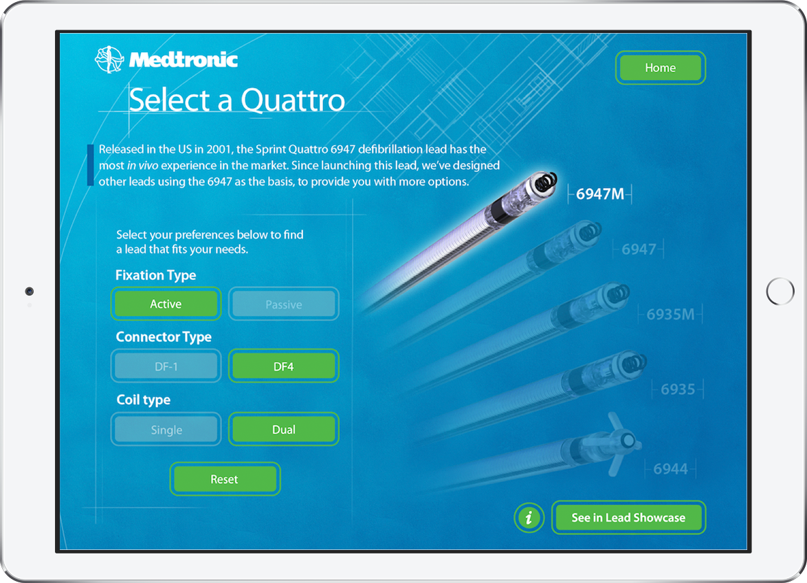
- Confusing interactive states and affordances were the main causes of Quattro's usability issues. In particular, participants struggled with the "Select a Quattro" product finder, which required the most experimentation out of all the modules.
Participants found that the filter functionality and buttons states were unclear:
“This one I’m lost on. I'm not sure whether I’m supposed to select the types again... I see, you have to reset first before it allows me to make changes.”
Another Discovery
The test results also revealed another design issue:
- Participants were overwhelmed by the content on certain screens, such as one titled "Proven by Active Monitoring".
- Pieces of information blended into each other, which made text and graphs difficult to read. Occasionally, some text was given more emphasis, and it wasn’t clear why.
"This looks extremely text heavy, although the animated action on this arrow on the right is inviting me to continue exploring. If that wasn’t actually moving I would’ve completely lost the call-to-action here."
Final Presentation
As part of my final presentation for INVIVO and our clients, I also recommended improvements for Quattro’s interactive modules and content organization, for example:
- Change the functionality of the product filter module so that users can modify selections without having to reset every time.
- Screens with too much content could be broken up into less overwhelming segments. I also felt that a visual indicator, such as pagination, should be included to show the total amount of information within a section.
These recommendations were documented for further discussion with our promotional app clients.
Credit: Visual mockups - INVIVO
